Boatworks

  • Main
  • Louve
  • Typewriters
  • Workshop
  • Meritaten
  • Glypto
  • Motoko
  • Inspirations
  • About

Imperial B - steampunk machine

December 02, 2023 by Lukasz Kumanowski

I think I saw this machine at first from profile view, on Robert Messenger blog and I instantly fell in love with how awkward and steam-punk it is. Rounded keyboard, interchangeable type-module, crazy ribbon routing - all these were a promise of interesting mechanical dead-end, my favorite type of typewriters.

The one I finally managed to find came damaged due to negligence of proper packing it for shipping. Quite common story for many collectors, I’m afraid. The screw holding escapement pawls got sheered due to a knock onto the carriage (presumably) and the carriage was stuck.

Removing the type element (keyboard with type basket) is done by simple flipping of two catches and pressing Figure key.
To remove the carriage one needs to remove one screw and lift the horizontal bar where bell and type guide are residing. After pressing Figure button (to increase clearance between the carriage and the frame) the carriage can be removed towards the right.

So there is my escapement, hanging sadly in pieces.

Rough cleaning first - disassembly into three main modules.

Platen could not be rotated since paper rollers melted and glued themselves onto the platen. They sat probably in the same position for a century. I cut them off to free the platen.

Remaining part of escapement screw was sitting inside the frame. Luckily it had a bit of the thread outside so there was something to grip, otherwise I would need to drill it out and possibly tap a new thread.

To gain access I removed horizontal bar entirely.

Screw-rests removal went fine. Assuming I have all escapement parts (didn’t found any more metal pieces laying loose in the package) I figured how it was put together.
Witness marks from the rounded separation brick and oval key-hole help the investigation.

View fullsize IMG_9844.jpg
View fullsize IMG_9845.jpg

What we needed then was a new screw. The original one has imperial thread (of course) and was roughly 12mm long. Very important thou is the shoulder which allows the lower, loose dog, to glide thus allowing the carriage to move by one “click”.

Luckily I had a screw with such thread, leftover after disassembly of some derailed Remington standard. I could modify it to match the original screw and put back the escapement into one piece. It should look like that:

With that dodged I moved on to proper cleaning and then oiling the machine. The only place I needed to add oil were carriage rollers - their bearings were dry and noisy. Cleaned and oiled with thin gun-oil they came back to life.

Type basket assembly then. It had the leather type-bar rest placed strangely.

This thick piece of leather has three springs attached.

Judging by cutouts on the side and how these springs are placed I figured it belongs to the top part of the piece.

Key-legends are yellow but originally they must have been white - it is just paper which aged. Key-tops are made of glass, not celluloid. The highest row of letters has key-legends damaged by oil ingress - they are legible but not nice and would quality to be replaced.
Unfortunately key rings are not the simple press-fit or tabs type but they seem to be crimped upon installation.
I don’t have a tool to mount them back this way so I don’t attempt to remove them. Instead I just clean them from all grime accumulated.

The carriage then. Disassembly is easy and straightforward. I document each step, just in case I mess up later on.

View fullsize IMG_9874.jpg
View fullsize IMG_9875.jpg
View fullsize IMG_9876.jpg

Paper rollers were shot. I removed their remains and fabricated new rollers.

View fullsize IMG_9879.jpg
View fullsize IMG_9881.jpg

A small detail - here apparently they removed a bit too much metal from the paper-rollers rod. A tiny bit really. The machine would work perfectly well anyhow but they added a tiny shim of the same diameter to fill up the space. How cool is that?

It reminds me a story of a guy who worked on an exact replica of a sailboat. He was making a copy based on existing but derailed hull. He wanted to experience the feeling the original owner had when he got his boat delivered to him by Herreshoff.
At some point the builder found that original shipyard had cut a piece too short and they added a shim, to cover for the error. It was not visible as it was deep inside the structure. Natural thing would be to correct this error when building the replica but no: the guy replicated that, too, for the sake of originality.

Back to business: the platen. Apart from rests of paper rollers melted into the surface the rubber was petrified and damaged. I was also rotating around the core, yielding the platen unusable.

View fullsize IMG_9884.jpg
View fullsize IMG_9889.jpg

After recording the original diameter I removed the old rubber, exposing a steel (not wooden!) core.

I applied new rubber coating, matching the original.

All pieces cleaned and put back together.

Fresh ribbon in crazy routing.

So how is it to type with her? Not bad at all! It is, in fact, very pleasant machine to type. Not like on Erika 5 of course but equally nice to type as with Oliver 5.

Well, I think we have a survivor!

The metal case is covered with surface rust but otherwise sound. I considered restoring it to original glory but for now I leave it in original shape. It tells a bit about the life of this machine.

Profile picture which started it all.

Controls on this machine are as straightforward as on any ancient typewriter. They are different from what we are used to but very intuitive anyhow as one clearly sees “what happens in the works”.

Paper fingers doubling as margin setting. Long finger activates the bell, too.

Left side of the carriage houses most controls.

Blue arrow below points to line ratchet release.
Black is line space selector - 3 positions.
White arrow is pinched carriage release.
Green is line advance “pinch”. Both line advance and carriage release can be pressed simultaneously in one swept.

View from the side.

Since this is a 3-bank machine there is double shift mechanism and each type slug contains 3 signs. Unique to this machine is that upon shifting it is not the carriage which moves but the keyboard (with type basket) is moving slightly backwards.
It is absolutely not awkward when typing as the shift is very small. Below photos try to show the concept.

View fullsize IMG_9911.jpg
View fullsize IMG_9913.jpg

So in principle this is a basket-shift machine! Just that the basket is firmly attached to the keyboard.

Ribbon spools sit on sides, held in place with ingenious latches. Below the latch is closed and ribbon reverse rod is pulled - this ribbon spool will now take in the ribbon.

Ribbon direction reversed (with rod pushed in) and the latch opened for spool removal.

Under the keyboard there are additional two controls: green arrow is pointing to backspace lever. White is pointing to something which I interpret as ribbon expose mechanism, probably facilitating easier ribbon installation.

When this lever is switched the ribbon vibrator is pushed outwards thus exposing ribbon guides and making ribbon installation easy.
If one types in this position the ribbon will not move back (vibrator is uncoupled) but ribbon transport is working.

Ribbon in normal position:

The side effect of this is that one can type in red - or use duo-tone ribbon. I consider this as a feature!

Shift-lock and Figure-lock is done with the same lever, with comb-like form. Vertical posts beside are shift and fig- height adjustments, similar to ones used for example on Blickensderfers.

Very interesting machine to play with and an eye-catcher in any collection. Good typer, too, if one understands that it is 100+ year old design.

December 02, 2023 /Lukasz Kumanowski
8 Comments

Underwood 4-bank portable

November 24, 2023 by Lukasz Kumanowski

I am a big fan of Underwood early models. This machine came to me in pretty good shape, with some minor issues. Just dirty and dusty like she was put on a display for half a century. Which may be true.

I started with fixing type basket stop pad. It was swollen (influencing imprint) and partially gone. Duane has a good video about repairing this pad, on my machine it was too damaged to rescue.

I decided to replace it with dense felt. Just to try if it would work. Plan B was making it from rubber, as original. Turned out that dense felt is doing the job alright.

Friction-fit, no need for glue. Each strike of the typearm is setting it in place.

Rubber feet were shot.

Someone tried really hard to keep them alive but it was high time to do something about it.

I made new feet from a round stock.

Capitals alignment was very much off so I took closer look on regulation screws. Turns out that even here Underwood made an effort to make carriage shift as quiet as possible. The landing pads were covered in rubber. It became black pancake after all these years and caused the adjustment to be off.

Cleaned and filled with new cork-rubber compound.

That cost me some extra time in adjusting both lower letters (base position) and capitals from the scratch but it was well worth the effort: shifting is now almost silent, instead of unpleasant metallic clank.

After the whole mechanism was dusted off I removed the platen and lightly sanded it, to remove outside oxidation. It is hard, of course, but no cracks nor dents so I leave it in place.

New ribbon can be winded onto existing spools using Underwood-proprietary ribbon winding port. Electric drill with rubber adapter is compatible with it.

So there we go! She types like a dream!

A handsome machine indeed - reminds me a bit lines of Continental 350.

Less boxy shape than its older brother, similar to Royal P esthetics.

Margin release button in the same place, slightly more ergonomic on angled panel of the newer machine.

View fullsize IMG_9676.jpg
View fullsize IMG_9677.jpg

Still the older one has more charming controls - here ribbon reverse lever.

Certainly both machines will keep their place in my arsenal. Typing and looking on them is a pleasure.

November 24, 2023 /Lukasz Kumanowski
Comment

Treasures of Paderborn

November 16, 2023 by Lukasz Kumanowski

I happened to be in Paderborn, Germany, on job-related trip. We had some free time so, apart from getting lost in this beautiful city we went to HNF: Heinz Nixdorf Museum. It is advertised as the worlds biggest computer museum.

Now, I’m not the biggest fan of computers but while browsing the museum’s webpage I found an Underwood somewhere in the background. And printing press. That was enough to justify the visit.

Boy, how surprised I was when I found the entire first floor dedicated to typewriters and office environment of that era. Magnificent!

Of course there are many German machines - we all love them, ain’t we?

Proper machines! And beautifully restored - or maintained in good condition.

There are also some monstrosities like adders, magnificent machines.

The exhibition is not limited to German machines, I found even “my” Remington!

… and my Siemag!

Office furniture - something I’m still hunting:

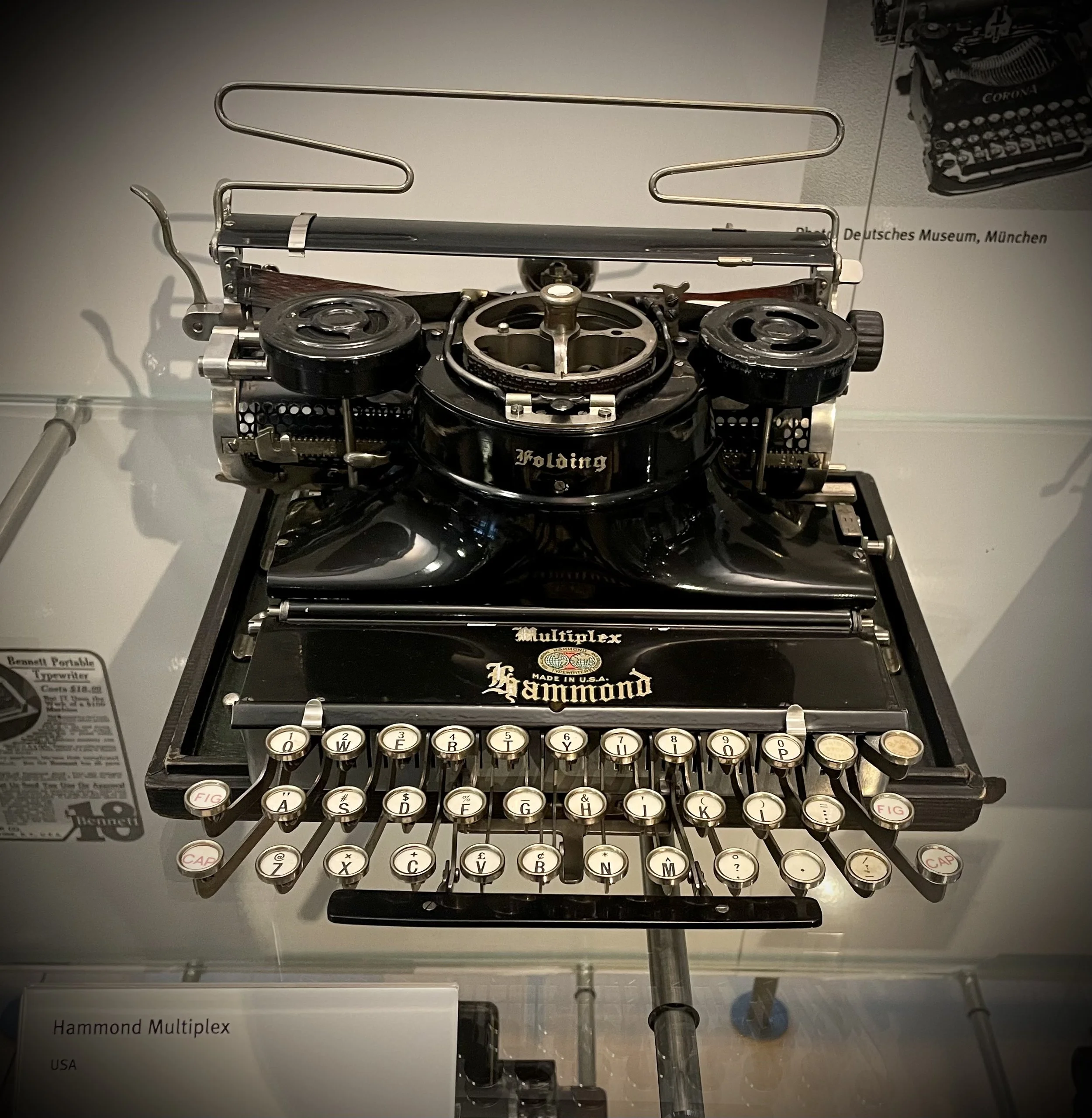
Early ideas on portable typewriters ;)

Further I went more interesting it was becoming.

View fullsize IMG_9701.jpg
View fullsize IMG_9709.jpg
View fullsize IMG_9710.jpg
View fullsize IMG_9713.jpg
View fullsize IMG_9721.jpg

Seeing Elliott-Fisher book-writer “in flesh” was thrilling:

Book-writer cannot exist in such a collection without music-writers. I found Melotype (opening this post) and Olympia Musicwriter!

View fullsize IMG_9706.jpg
View fullsize IMG_9707.jpg

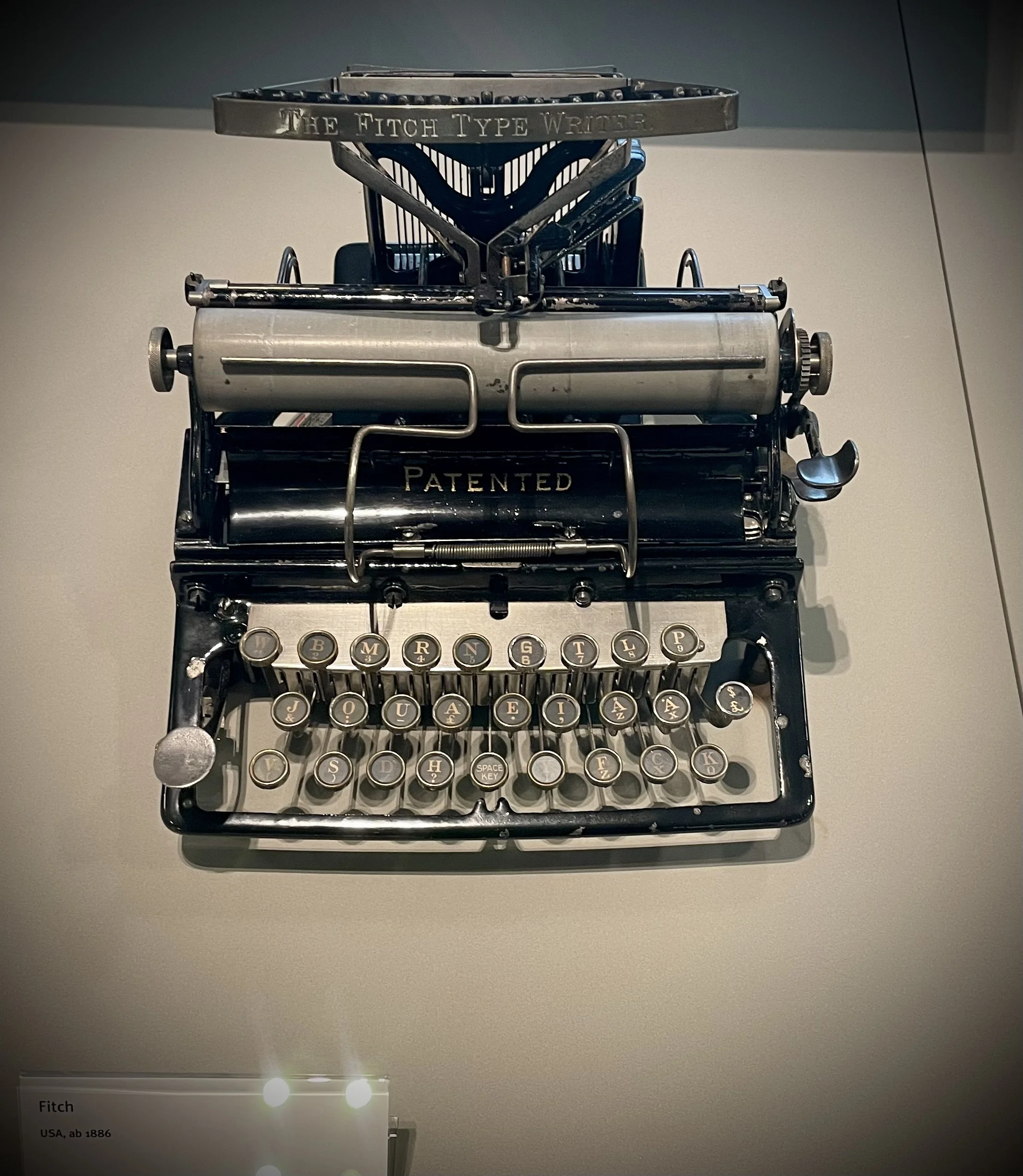
Going back in time - there is a great collection of really old machines.

View fullsize IMG_9711.jpg
View fullsize IMG_9712.jpg
View fullsize IMG_9714.jpg
View fullsize IMG_9716.jpg
View fullsize IMG_9717.jpg
View fullsize IMG_9718.jpg
View fullsize IMG_9719.jpg
View fullsize IMG_9720.jpg
View fullsize IMG_9722.jpg
View fullsize IMG_9723.jpg
View fullsize IMG_9728.jpg
View fullsize IMG_9727.jpg
View fullsize IMG_9724.jpg
View fullsize IMG_9729.jpg
View fullsize IMG_9732.jpg

Yes, there is Lambert, too!

No such collection can be complete without Sholes & Glidden. There are two!

View fullsize IMG_9725.jpg
View fullsize IMG_9726.jpg

Very early prototype of wooden machine, typeface consisting of dots instead of type slugs:

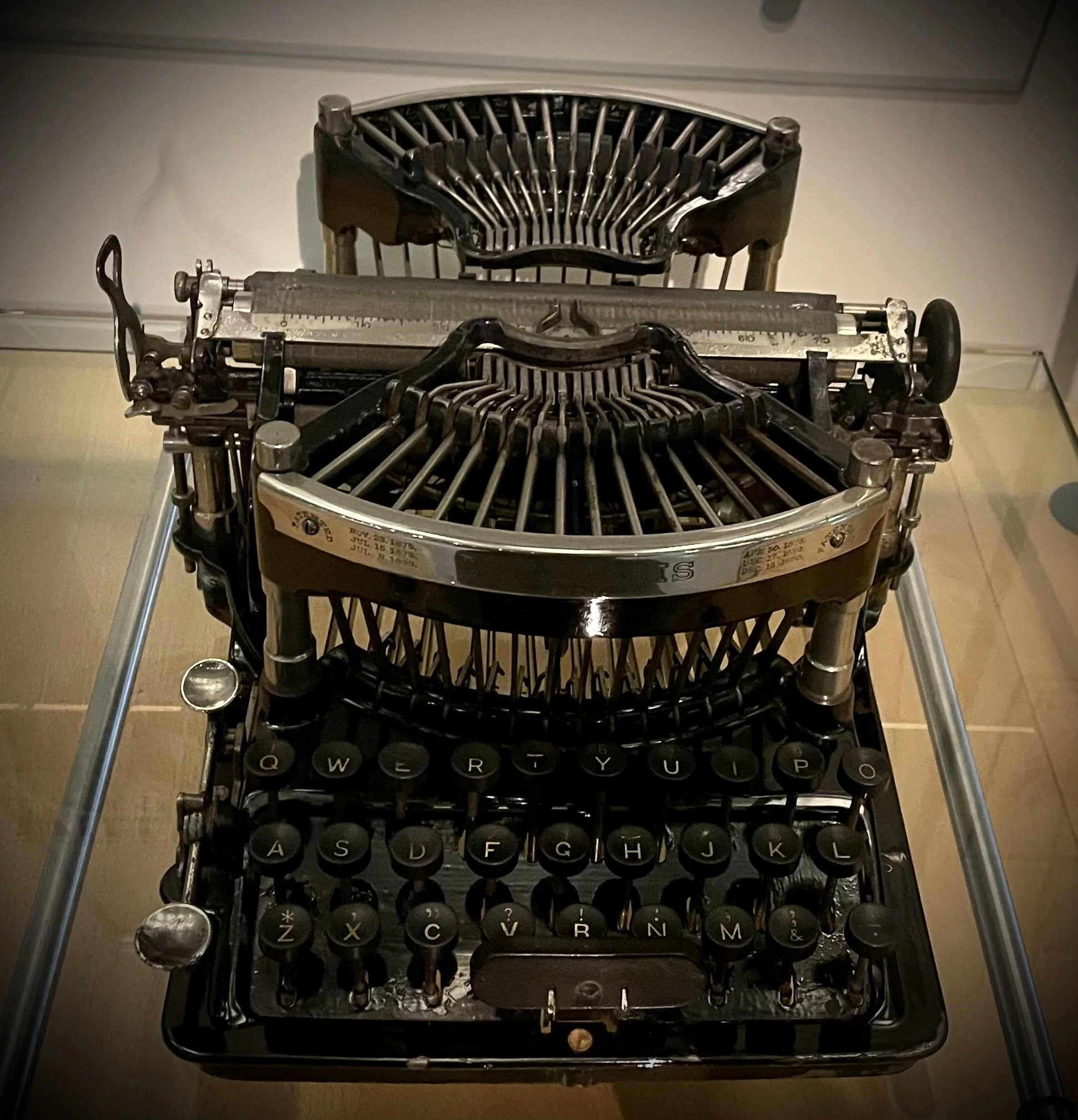
Biggest surprise for me was to see how small and beautiful is Williams, here Williams no.1.

View fullsize IMG_9730.jpg
View fullsize IMG_9731.jpg

So there you go: visiting computer museum can make you a surprise. In fact the museum is considering “computer” in much broader sense than we tend to think about it today. The exposition shows mechanization of information, from early typing machines, through typewriters until today’s digital processing.
Mechanical crank-heads like me will be occupied on two floors, looking onto ingenious ways humans used to store and to process words, numbers, thoughts and music.

Very worth visiting!

November 16, 2023 /Lukasz Kumanowski
Comment

Bulbous typewriter - Remington Quiet-Riter

October 29, 2023 by Lukasz Kumanowski

This fellow came from a good home - was certainly been cared for and used not too heavily. It was also lucky to be serviced by a proper mechanic - all screws are intact, no butchered slots and all alignment is spot-on. Moreover - it has a brand new platen! The rubber is fresh and springy, typing is silent and pleasant.

The only problem was dust and molded ribbon. Certainly the machine was put back into its case and forgotten for many years, stored in room temperature in a wardrobe, I suppose, not on cold attic. Good for her! No rust, no solidified grease, just dust.

Another minor issue was variable line spacing mechanism not working.

To keep her in tip-top shape I decided to transplant clean and fresh ribbon winding mechanism from a younger Quiet-Riter 11 which is my donor machine.

Removing ribbon winding mechanism is easy, only on left side one needs to unscrew pull-rod for backspacing. On younger machine this rod is formed to pass under but on older version it is just straight and is in the way. I marked amount of thread to be visible before unscrewing - for easier calibration afterwards.

Old spools were covered with ribbon rests and metal coating was damaged.

While at it I renewed type-arm rest. With fresh rubber it will be even quieter when slugs hit home position.

All body panels got proper cleaning and drying. Sound-proofing is in perfect shape and fresh so I leave it as is.

Mechanism dusted off, body panels clean - assembling back all pieces.

Serial number is found close to right ribbon spool, on the frame.

To remove the platen on newer Riter one just unscrews both knobs by twisting them, they screw out with partial axle on both sides and the platen can be lifted.

Not here. This older model still carries the old style construction, with platen axle being a full-length rod. But there is a twist: line-spacing ratchet de-coupling mechanism is operated by a separate rod which needs to be removed first, before the axle can be removed from the right side.

At least that’s how I done it. I wanted to check variable line spacing mechanism anyway.

The mechanism is simple: three toothed surfaces of the platen clutch engage with toothed band on the inside of platen’s left metal collar. Clutch engaged.

To disengage one presses-in left platen knob which pushes a short rod gliding inside platen axle which, in turn, pushes the clutch away from toothed surface. Clutch disengaged, line spacing becomes variable and permanently changed.

To assemble back the platen I inserted the axle from the right. Empty axle emerges from the left.

Insert the short rod into its channel…

… and rotate the axle by 90 degrees, to see surface for landing knob’s set screw.

This part is important, so that we don’t press the rod with set screw because it will block clutch mechanism. Which was exactly why it was not working when I got the machine.

With all assembled back together the machine was ready for work.

I much prefer this earlier version, with rounded, bulbous ribbon cover.

Newer versions have the logo made from plastic, here it is brushed metal. Nice detail.

Left side of the carriage houses most controls: carriage release, variable spacing with clutch release (platen knob) and without clutch release (thus non-permanent spacing alteration).

Three sets of line spacing: single, one & half and double line.

Being a 50-ties child the machine has a “car hood” instead of ribbon cover. Bi-chrome selector for red, blue and stencils on the right. Ribbon reverse lever on the left.

Speaking of cars and 50-ties, I had to compare this Remington with another bulbous machine from that era: Underwood.

Not as radical as Underwood, Remington is more toned down yet has a slightly bigger footprint.

Mugshots reveal that it is also a bit higher.

Both are handsome machines, Remington being less extravagant I suppose.

They were big competitors back in the day. Shouting on each other with wide-open hoods!

Typing on this Remington is very satisfying. The action is smooth and soft but not spongy. It is a silent machine. Basket-shift, ergonomic key-tops, well spaced keyboard - suites me very well.

Typing action reminds me one of another bulbous machine from that period - Hermes 3000. I agree with Ted Munk on that: typing out on this Remington is very comforting.

Hermes is, however, even bigger and wider!

“Bulbousness” in its best, with Hermes leading in sophistication of shape.

Remington not as extravagant or sophisticated but still very robust and comfortable tool for serious writing. And not an eyesore either!

October 29, 2023 /Lukasz Kumanowski
2 Comments

Gossen Tippa - office in a briefcase

October 22, 2023 by Lukasz Kumanowski

This little gem came to me dusty and dirty but in working condition. Mostly. One obvious problem was that backspace was not working. After removing the ribbon cover it became obvious that the key is not connected to anything - the lever was missing.

I started with fixing that. Eyeballing the most convenient way to lead the linkage gave a shape as follows.

Linking spring-loaded key lever, under the ribbon spool post and into 90 degree pulley. It works perfectly so I think the original was, more or less, the same.

Another problem was dried and damaged type-arm rest. It was made of rubber, glued in place. I don’t think this is how it was originally, I would rather expect felt. Anyway, this was not doing its job - slugs were landing with loud “clack” and some of them were hanging above it. New and thicker landing pad was needed.

I scraped the old rubber and removed all glue. The L-shaped rail has four holes which maybe were used to hold the pad in place. I decided to use them that way.

I cut a stripe of synthetic felt which will be sewn into a half-circle pipe, making it thick and sound-dampening.

Saw by hand - relaxing job!

I put that aside - it will be installed once the machine is clean.

Removing the platen is pretty standard: starting from the right knob which is held in place with two screws.

Unscrewing two screws close to ratchet wheel frees the platen rod which can be then extracted with the left knob.

On the right the platen has a thick shim/washer which fills the space for tight fit. Good to pay attention and not loose it. To extract the platen one needs to unscrew paper bale and paper table first - pretty straightforward with just two screws. Paper table is held with a spring (on the right side) which needs to be unhooked. I leave it hanging.

Feed rollers assembly comes out right away, held in place with just two positioning pins. On my machine the rollers were in perfect shape so I just clean them.

Line advance ratchet can be a pain on some machines so, to avoid headache upon re-assembly I keep all in place with a bolt, in absence of the platen rod.

Dusting-off and cleaning followed. Luckily this machine was saved from excess grease or WD40. It had lots of stains, thou, which were sitting hard on crinkle-painted panels. With some surface-active chemistry I managed to clean them without damaging crinkled surface.

Dents and oxidized surface of the platen got sanded away on a lathe and cleaned.

Time to assemble all back. First comes new landing pad for type slugs. Mounted in place with black string through holes in the rail.

Rubber feet were gone - hard as plastic and flat as pancakes.

Unscrewed and pried out.

I made new ones - Biltema’s rubber set came to help, as usual.

I managed to disintegrate line advance mechanism upon re-assembly. It gave me a bit of headache to put it back together properly so here comes detailed pictures for anyone having the same problem.

With platen back in place I installed an old ribbon - to test type alignment. With faint imprint it is easier to see if cylinder needs adjustments. On my machine it was clear that it does need it.

I started with lower letters position. Adjustments screws are on both sides of the carriage.

For capitals there are similar screws on the back of the machine, both sides. Thin screwdriver is needed to access them through small openings in frame’s back panel.

Easy yet a bit frustrating process - after several repetitions I finally managed to get decent imprint and level for both capitals and small letters.

Next came additional adjustment: line level across the whole length of the platen. Done!

Lastly shift-lock position was adjusted. Tippa is a proper machine - it has adjustments screws for that so no need to bend metal (sorry: “to form metal”!).

Test-typing with old ribbon show nice, equal imprint. Time to install new ribbon and screw back the bottom plate. Last look onto the frame and easily accessible escapement.

And so she is done!

Tiny typer, much lower than matchbox!

;-)

Well, not really. Depends on matches but “benchmark” matchbox is of the same height as the machine. She is flat!

All panels are made of aluminum so the machine is lightweight. Not as light as its younger incarnation I fixed before but much lighter than Groma Kollibri.

Paper support /wi-fi antenna swings from the back.

Slick and very “technical” design. Left side features even touch control - two positions.
Back panel with dealer plate and factory logo. Aluminum, screwed in place.

Right side with ribbon wind/manual reverse knob. Automatic ribbon reverse is present, of course.

I like these small design details: here the line advance lever in erected position.

After engaging carriage lock the lever is folded down into storage position.

I would call this design “utilitarian”: there is nothing here which is just for beauty, all has its purpose. Triangles on both sides, with textured surface, are here to enable lifting the machine from table. She is so flat that there is really no other place for grabbing her.

Tiny and unobtrusive logo on the right - that’s the only ornament this machine bears.

She reminds me of other German machine of that era, equally flat and utilitarian.

Tippa has slightly bigger footprint due to its wide base-plate.

But both machines are super-flat ultraportables.

To be fair I should add that Groma Gromina should be used with its wooden base, she is not made to be detached from it. I added small rubber feet to Gromina to be able to use her without it but lap-typing is not advised while Tippa is very well suited to that, with its base fully covering the mechanism.

How is she then compared to younger cousin Groma Kollibri?

One can clearly see the spartan approach in Tippa, compared to curvy and flashy Kollibri but size-wise they are in the same league.

My machine came with its aluminum cover and leather suitcase.

Closed machine hides in the main compartment leaving place for necessary office utensils in the second compartment.

At first I thought that this is faux (artificial) leather, with these deep patterns embossed on it but upon closer inspection I think that this is indeed real leather. It ages like one and feels, too. I don’t think they had technology in 50-ties to make artificial leather so much resembling real one as we have today. And the case is surely original from 1955-ish.

Great article about Gossen Tippas by Robert can be found on his blog.

A scan of the original manual to the machine is available from Richard Polt’s web page.

So how does she type?
She types very well!

Compared to Groma Kollibri - much better!

Compared to Groma Gromina? Equally well, maybe a bit nicer. '

Compared to Antares Parva?
No, Parva is still my best ultraportable, Tippa being very close on the second place now.

October 22, 2023 /Lukasz Kumanowski
Comment

Remington Rand 5 with rotten keys. Fallout machine.

August 30, 2023 by Lukasz Kumanowski

This was one of my “parts machine”. It had ugly, damaged and rusted keys and lacked parts which I picked for fixing other machine. Body panels, originally in crinkled black, were ugly repainted at some point. I planned to dismantle the machine into screws and spare parts and throw the rest.
But there was some life in her and, more importantly, typeface is in Elite-size. I decided to give her a chance.

First I needed to remove the paint. That went quickly, with heavy chemistry and a few days of soaking in plastic bags.

I like this bare-metal look. Streamlined body looks nice in silver, a bit like Airstream.

Keys then.
There were no signs of corrosion in the whole machine apart from keys. Key legends were delaminated and sticking out of key rings. I suspect that someone cleaned the machine with water at some point. It got soaked into cardboard key-legends and stayed there for years, doing its nasty job.

I don’t have a dedicated tool for removing key rings so I made my own: converted nail lifter (ugh!). It is a bit finicky to use but it did the job alright and costed me 10 dollars plus some effort to re-work it.

With key-legends removed the scale of damage could be assessed.

Definitely job for Evaporust. At first I dispensed it only into key cups, hoping that a few hours soaking will dissolve the rust.

It didn’t so I doped the whole keyboard and left it for a few days.

That did the trick: keys emerged with no trace of rust.

I punched new legends from synthetic cork. It is water resistant and offers a bit of cushioning for fingers.

My plan was to cover the cork with printed key legends in classic style: black letters on white paper. However - why not leave the cork visible? Will it not add a bit of organic warmth to this otherwise cold-steel machine?
I took her out into sunlight to decide.

Ain’t bad, no? A bit MadMax style. Or Fallout maybe?
OK, so let’s make key legends in a bit unusual typeface, to go with this sci-fi theme.
I printed them, in mirrored direction, on OHP-foil. This way the plastic is protecting printed letters from being wiped during typing.

Key rings, cleaned and polished, were easy to press back into their place. I used a set of parallel pliers and thin wooden stick to protect the rings.

And so it became quite a sexy machine! I made new springs in place of these which were missing, fixed problems with the mechanics, cleaned and oiled the mechanism and she types again.

It looks that we have a survivor!

August 30, 2023 /Lukasz Kumanowski
2 Comments

Simon techno typeface for Blickensderfer

April 16, 2023 by Lukasz Kumanowski

Now that is a little perverse: implementing ultra-modern, science-fiction inspired typeface for ancient, manual typewriter. Ain’t it?

But why not?
I am a big fan of Simon Stålenhag. Really good, hard science-fiction.
In one of his albums there is a line showing an old computer printout. I fell in love with this typeface! How about implementing it on Blick?
It is just two sentences so not the whole alphabet is used. I had to draw remaining letters to match the esthetics.

At first I thought it is a typeface used in Alien series. Nope.
OK, then maybe Blade Runner? Nope.
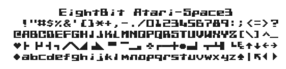
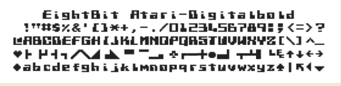
So Amiga or Atari? Well, also “nope” but that led me to super inspiring website driven by enthusiast who preserves old Atari typefaces: https://atari8bit.net/projects/artwork/atari-fonts/

I’ve contacted Steve and he kindly allowed me to post a few screenshots of these fonts. These were ones I used to draw my typeface, to resemble the one used by Simon Stålenhag in his book.

View fullsize IMG_7490.jpg
View fullsize IMG_7491.jpg
View fullsize IMG_7493.jpg
View fullsize IMG_7494.jpg
View fullsize IMG_7495.jpg

I chose these which have a “serif” - dark pixel - at the base of a letter. They are not exactly as in Simon’s book but resemble it well enough to be helpful in my project. Besides - as these are available for download on Steve’s page - I may implement them as well!

I’ve called my typeface Simon techno. It took a few implementations to nail it, below is one almost finished - with some mistakes in number 7 and too narrow space between letters.

With final corrections there it is, with slightly thicker letters, a bit more spaced from each other and with R made differently from Simon’s, to distinguish it more from letter A when printed on Blick:

As I was feeling playful I made an opposite version - stencils - of this typeface. Kind of playing with my previous struggles to get rid of artifacts around letters. This one is all but artefacts, with letter not printed:

Well, obviously a partial success. It is too difficult to read and requires really heavy inking. What inspired me was -again - a branch of such fonts on Steve’s page:

So what is next?
Well, one of Atari typefaces for sure!

April 16, 2023 /Lukasz Kumanowski
1 Comment

Under wood. Underwood?

April 16, 2023 by Lukasz Kumanowski

Very busy weekend - we are already preparing for the next winter, stapling wood in the barn.
It was a hard winter this year and it may get even worse the next winter - given state of things in the world. It frees my mind to have this done already now, when weather is mild, no mosquitos and flies yet.
It took us 2 days to fill the place with birch wood. Almost done, a few cubic meters more in coming weeks. I must have been very tired because I constantly thought of myself as “under wood”. Which brought me an idea for a small photo session.

I know it’s a bit childish but… hell, all reasons are good to bring out this beauty and admire its lines!

April 16, 2023 /Lukasz Kumanowski
Comment

Harrington Mk7 - modified type element for Blickensderfer 5

April 09, 2023 by Lukasz Kumanowski

Winter is unwilling to let go this year but today we got a sunny day.

I was modifying Harrington typeface to match my 3D printing process. Letters became bold, to get better margins with direct inking technique used on Blicks. This typeface is very delicate but proportional and is otherwise very suitable for Blickensderfer.

The result is good. Finally!
With felt ink pad and oil-based ink the imprint is of reasonable quality. I’m not sure I can get it any better.

There will be one more iteration before I consider it done: I will replace fractions with Swedish and maybe Polish letters. Although I finally managed to implement fractions with this Mk7 version - I don’t really use them! And I lack Swedish letters when typing a letter. Having them at hand will make the type element more suitable for my use.

So there will be Mark 8, most probably the final revision!

April 09, 2023 /Lukasz Kumanowski
Comment

Underwood Finger Flite Universal. Fifties esthetics at its best.

April 02, 2023 by Lukasz Kumanowski

Not exactly rare machine, quite the opposite, but a great looker and magnificent typewriter. Basket-shift machine, no-nonsense operation, very light and snappy touch. Moreover - very easy to service, I dare to claim that Underwood engineers were thinking about servicemen when they designed this machine.

My specimen was just dirty. Very dirty but still working fine. It also had type bar broken but luckily it was still attached to the machine.

The usual procedure - stripping down to bare bones for cleaning and inspection. Body panels are kept with just a few screws. To remove the front and side panel one needs to unscrew ribbon-wind/manual reverse knob.

It is a left-hand thread.

Right-hand platen knob goes out after loosening the set screw.

Left-hand knob has its set screw hidden longer inside the axis.

Pulling it out, like for de-coupling the platen line spacing ratchet, reveals the screw.

To gain more place for platen removal I removed the paper table. Loosening locking nut and backing the set screw unhooks the table from its pivot.

As the table was not sitting exactly in the center I adjusted the similar screw on the other side.

Now comes the platen. It sits tight and paper-release lever is in the way.

Just take the lever up - paper release position - and you get a clearance.

On the left side the platen is still held by its axis. It cannot be removed while the platen sits in the carriage so just press it into the platen. After the platen is out it can be pulled out with pliers or pushed out with the platen knob from the other side.

Extracted from the platen the axis shows clutch release cone.

The platen was in good shape but bearing marks of frequent use. I sand it smooth and clean the oxidized rubber.

Paper deflector is in excellent shape - no rust, no dirt either. It is hanged with similar pivoting concept as the paper table.

You don’t have to remove it to inspect and pull out paper rollers. Just lift it and swing out of way. Servicemen-friendly approach.

I remove it anyway, for better access for cleaning. Loosening one screw, on the right side of the carriage, frees the component.

Service-side of the carriage - with line advance and ratchet pressure roller - nothing flies away in absence of the platen. All sits secured. Again - servicemen in mind: easy to clean and to repair.

Serial number on the rail of the carriage, right side.

Machine ready for cleaning. It was enough to brush it and blowing dust with compressed air. Remaining, accessible dirt cleaned with stick-pads.

Spacebar is made of Bakelite. It bears traces of unsuccessful gluing. Looks like a glue to bond rubber, no wonder it did not hold long.

I considered my options. I could use this piece to make a new key. To match a burgundy color I could carve it from mahogany.
Or I can try to salvage the original key. Worth trying, always better with original parts - and this one is a sign of really brutal excitement!

I clean all rests of the old glue.

Tedious job but necessary to provide reliable surface for epoxy. I used fast curing semi-transparent epoxy. Left excess until partial curing, I will cut it once half-cured and sand the rest after full cure.

While this was left to cure I clean body panels. I use sunny weather to dry them on car roof.

Type slugs cleaned.

So why was the spacebar broken? One reason may be that the owner - or repairmen - installed too thick rubber bumpers on the bottom tabs. There was not enough space for them, spacebar could not be pressed down enough to trigger escapement. To “fix” the problem someone bent the bottom of the panel, to gain 1-2 mm room. All that instead of simply replacing these rubber rings with something a bit smaller.

Fixed that by replacing them with thinner, silicone tubing. Bottom panel straightened back to original shape.

With the mechanism cleaned, platen sanded and cleaned I assemble all back together. Straightforward process. To install the platen it is best to press the axle all the way into the platen. It will be pushed out after installing the right-hand platen knob so no worries.

Original ribbon was at its life-end so I wind a new one: cotton!

This machine needs to have rivets - or any kind of hinder - on the ribbon, to trigger ribbon reverse mechanism. Neat solution with document binder pins:

View fullsize IMG_7501.jpg
View fullsize IMG_7502.jpg

Done!

So finally - type test!

Time for photo session. Lines of this machine remind me Buick Super from the 50s.

Even ribbon cover opens like a car hood.

What’s under the hood? Type strength regulator, of course!

Decals on this machine are in pristine shape.

Ribbon color selector is also a decal.

Underwood emblem is in painted metal, a few chips in paint reveal yellowish metal surface.

I’m glad that I saved the original spacebar. It shows clearly that it was repaired but functions perfectly and bears sign of events full of anger (I think).

I added epoxy fillet underneath. It adds lots of strength and is only visible when the machine is up-side-down.

Fantastic machine indeed!

April 02, 2023 /Lukasz Kumanowski
6 Comments
  • Newer
  • Older

Powered by Squarespace